Developing ideas into designs:
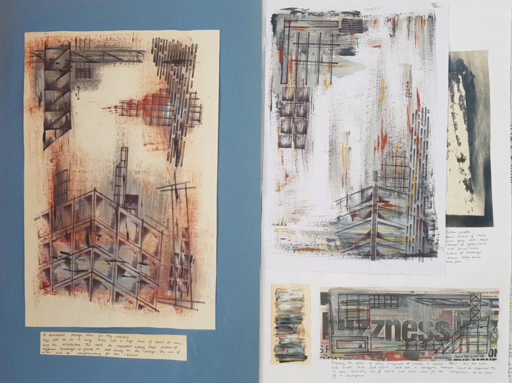
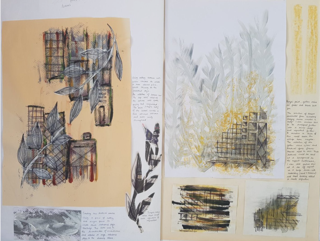
Developing drawings from previous pages in my sketchbook into design ideas for my 6-8 designs. I have experimented with creating different textures suitable for the background that represents either architecture or nature.
For these I have used a simple colour palette of white, grey, black and burnt Sienna. The use of layering and a range of techniques makes it appear as though many different colour shades have been used.
I have begun to explore different compositions to see what would work as a design, or what colour be developed into a repeat. I will explore further to determine what will look more professional and effective.

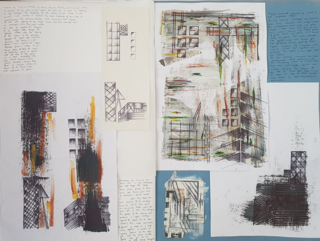
Inspired by ‘Faiground movement’ by Charles Stewarts painting on canvas.2013
A similar use of colour is used within his work as to what im exploring in my drawings. The simplicity of the chosen colours adds to the painting and creates contrast. The bold simplicity of his work is complimentary. The textural strokes add dimension and depth. His work was inspiring to my drawings that I’ve developed across these pages. Within his work he captures the movement of his subject matter through the aggressive strokes used. The layering of the colours in this painting highlights the lights that would be flashing and moving in a fairground. I have captured the light reflection found in a window of a luxury block of flats. The lines of watercolour paint add to piece in a more contrasting way than Charles Stewart’s in Fairground Movement, however, they have a similar outcome in terms of the marks made and overall effect and impression it gives.


Recent Comments