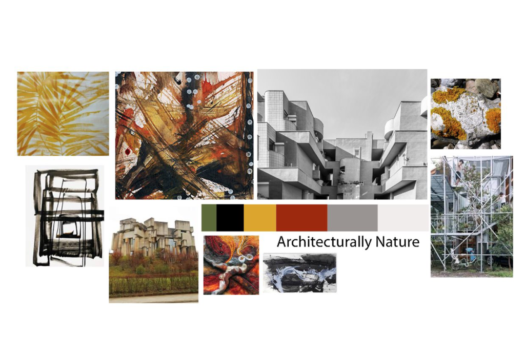
Researching into colour found in nature and architecture and the reasoning for this:
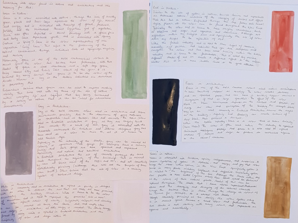
Green in nature-
Green is a colour associated with nature, through the link of healthy grass, plants, and trees. Green represents the colour of life, renewal, and energy, and is associated with meanings of growth, freshness, fertility, and environment. Ancient Egyptian god of vegetation, Osiris, was often depicted in mural paintings with a green face and body. Green represents youth, and is associated with spring (nature in spring?)
Green is the colour representative of the expression ‘Going Green’. This refers to preserving the natural environment, through activites such as recyling, upcyling, and reusing.
Historically green is one of the most controversial colours. In recent years the colour has become more fashionable, with two shades of green, a vivid chartreuse a soft sage green, being named Etsy and Behr’s 2020 colours of the year. It is believed by many sources that green is to be the colour of the decade, however, a lag in the textile industries eco awareness is preventing this.
Researchers believe that green can be used to improve reading ability. This links well with my theme of the use of nature within everyday life and signifies that by simply being surrounded by, or looking at nature, that you will have the benefit of improved reading skills.
Grey in architecture-
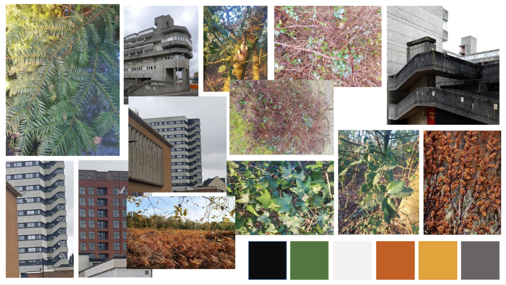
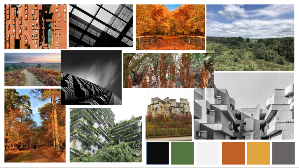
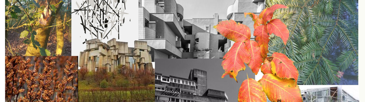
Grey is the most common colour sued with urban envrionments, possibly due to the dominance of grey materials in construction-such as tarmac, steel, and concrete. The main colour used in Brutalist buildings is typically grey, as they are largely built from concrete. As a result of this, grey is associated with the manmade environment. For architects and interior designers grey has long been a colour to turn to, as it is known to add timeless style.
Depending on the intensity of the shade, grey can be viewed as calming or oppressive. Pale greys for example have a calming feel, and dark greys are more oppressive and represent masculinity and nature and industrial architecture.
In Brutalist architecture the use of concrete portrays the same shade throughout the majority of the buildings. This is viewed by some as bleak relics of the 1960s and 1970s, and not something aethsetically pleasing (although this was not the intention of them when built). Others believe that the use of colour is a striking symbol of modernist design.
Black in Architecture-
Black is one of the most common colours used within architecture to make something appear as receding. The colour creates darkness and an oppressive power, and can make a building appear ominous or dungeonlike if used in large quantities. The effect of the colour black in urban envrionemtns depends on the context and position, to change our view and perception of the building. For example, black may not be used commonly in brutalist architecture, however the angles on the building, shadowing, and lighting, can create sections of deep black on the architecture; that produces a darkness.
Within the textile industry, black is a colour ‘that is taken seriously’ (Karen haller). The colour is often used within the industry to represent seriousness, intelligence, prestige and power. It is also used to reflect emotions of sadness and anger, to produce an emotionless response to the viewer/consumer.
White in Architecture-
White is used commonly in architecture to reflect a purity in their designs. With no colours to distract, the lines that are made are more prominent, accentuating the building structure. White is known to be the colour of minimalism, and is used in as a representative of the premises ‘less is more’. The colour reflects notions of clarity, brightness, crispness, and cleansing.
It can be viewed as being too sterile, dull, and empty when used largely in architecture, as little energy is created. The sterile energy formed by using white is reflected in Brutalist architecture and the simplicity of colour and design used within it.
Yellow in Nature-
Yellow is associated with sunshine, spring, enlightenment, and happiness. A common symbolism of yellow is optimism, and energy and joy that the colour brings the viewer. Within nature, in the New forest specifically, yellow is found in many plants, including sunflowers, and daffodils. Universally yellow is related to the brightness of the sun. Although the shade within my colour palette is more muted (yellow ochre) than what would typically be perceived as the colours of these natural plants, shades of this can be captured throughout. The shade that I have chosen represents autumnal nature and the changing and decaying of the natural elements throughout the seasons. This is shown through the change in colour of leaves for example, to a warmer, rust shade of colour.
Although commonly perceived as too daring, the colour ochre yellow has In recent years become a trend colour and fashionable. The ochre shade is not clashing with many colours, and represents an elegance and wearability.
Red in Nature-
Similarly to the use of yellow ochre within nature, burnt Sienna red represents an autumnal nature, inclusive of the changing of seasons and affect that this has on nature. Reflected through tree sap, fallen oak leaves, dyeing flowers, etc. the colour can be found throughout the new forest.
Typically the colour red is known to have many varying connotations, such as pleasure and anger, and aggression and dominance. Although not reflective within my subject area specifically, the use of colour alters my designs to be reflective of this ideal.
Within the fashion industry, red is used to show signs of romance, sexuality, and passion, and indicates that you are outspoken and energetic. The colour red has been used heavily within the textile industry and is known to be fashionable. This is used by various different shades of red to perceive a different effect to the viewer, whether this is in a more subtle sense or to grab attention.